- Excitement
- Excited
- People


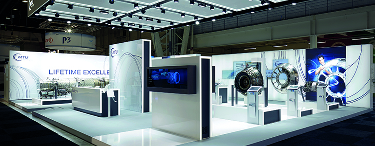
The team’s pride is at stake. We are on a mission: we want to perfectly translate the values and capabilities of the customer so that visitors of all backgrounds grasp instinctively the essence of the MTU brand. It is all about designing a stand architecture that conveys the message „Lifetime Excellence“ / „Engines for decades“ in all three dimensions. The design must not only be perfect and flexible. It must be timeless and universal. In a nutshell: it must be as good as MTU itself.

The new shapes and lines fit exactly with the new print and screen CI of the group. The architecture is not only reduced to the max: it is pure and beautiful. White surfaces let the information stand out. Orthogonal outlines generate a matrix. There is no place for the arbitrary. The „Sparkle“ is the new central element of the MTU advertising: it is now the inspiration behind the new 3D concept. It brings in "pure light" not just "lighting" on the stand and stands for transparency and fascination, for technology and for performance. The „Sparkle“ is the magic that makes „the invisible be seen“. It grants visitors access to a new dimension: the world of MTU.

„Engines for decades“ – the highest performance and resilience can only be represented with best-in-class materials and finish. On the new MTU stand quality can be felt in the way lines run through the design and in many small design details. The intelligence of the architecture is not only seen in the high potential of the stand in terms of communication and attraction. It is also clearly perceivable in the modularity of the display. Re-usability is carefully considered in all design decisions taken. This paves the way for more efficiency, better quality and in the long run a small contribution to our environment.
