- Excitement
- Excited
- People


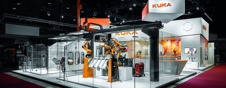
High-tech is for the people: the stand needs a personal and emotional touch. The KUKA solutions are displayed in a way that they can be easily accessed and understood. The hospitality zone well deserves its name: the bar counter embraces the area and is perfectly integrated in the architecture. For better orientation, VRPE also designs “branding cubes” that are more than just that (cubes). The complex polygones do not make our lives easier when it comes to drafting the stand layout but they make the stand more attractive and trigger curiosity. That is all that counts. At this point, we embark for the last design job and re-interpret the polygons-based graphic design of KUKA: the result is a fluid band and a symbol for KUKA mastery of metal processing.

Admittedly, we are not machines but we work relentlessly and flexibly until the very last minute: we accommodate all wishes of the KUKA-Team in a pragmatic way. Changes are taken in account and passed seamlessly to the planners and builders. They know how to adapt. And because we pay attention to details: we take time to revisit the arrangement of the support functions. As a matter of fact: a clear distribution of areas and flows brings about better operations during the show. It is not only about efficiency: it is about well-being and smiling faces.

Talking about clarity and well-being: we are light fanatics. And that is something one can see clearly on the KUKA Blechexpo stand. The lighting concept has been minutely put together. Shapes stand out clearly and contrasts are sharp. Just like the intelligence of KUKA’s machines. Yet again: with such a good lighting, you have to deliver the best quality. Everything would not just be below our standards: it would immediately noticeable. The result is not only a good stand but a new partnership! KUKA is pleased. We are happy.
